
The 5 typography hacks in this blog post will take you less than 5 minutes to implement on a well built WordPress theme. Take the time now to make these changes and you’ll see a significant improvement in Google Analytics. You will see the greatest improvement if your site is focused on a single information niche.
I am the Webmaster for a large government regulatory agency, with over 80 experts who create and maintain over 7,000 web pages. The content is mostly written by engineers and technical staff. My role is to create an environment that facilitates the dissemination of information created by our professional staff.
The content on the website that I manage has nearly 1 million page views every month. We have a 48% abandonment rate, with an average session time of nearly 3.5 minutes. The page session time on some specific individual pages exceeds 30 minutes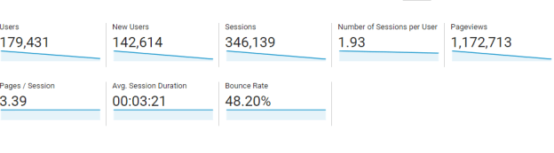
My expectation, as a content manager, is that a page will rank high within Google’s search results. I am often asked “How do I make my page show up in search results?” by content writers and subject matter experts.
Today, I’m sharing 5 basic typography tactics that will help you answer this question. I am also employing these tactics on this blog post, as well as on my podcast, and in my YouTube videos because the same principles apply even though they are each a unique and different media type. The rules on the SEO road apply equally.
First, a prerequisite statement. If you want your blog content to rank prominently in Google’s search results, the first step is to pick an information niche on which you focus. Do not deviate from the focus of your information niche, else your rankings will not be as high as you prefer. The second step in good SEO is to make your content easily readable and scannable, which is the subject of this post.
1) Use a Content Width (Body Area) of at least 800 pixels.
The first hack is perhaps the easiest to understand. Content is all about serving your site visitor with readable, usable, searchable and accessible information. One of the ways in which you can do this is by limiting the width of your content area. Studies have shown that people reading the web do not act the same as people reading a book.
Website visitors arriving at your site via a Google link in search results will scan the text above the fold on the first page. They have an expectation to find information quickly. Since we are using English, we know that the information the page starts at the top left, carries right and then down the page. Anything that gets in the way of this eye movement will frustrate your visitors and cause them to abandon your page.

Your website should be optimized for the most common resolution (1024×768 followed closely by 1920×1080), with less than 20% of browsers using an 800×600 resolution. With that said, the body text area of your website, within the 1024×768 monitor resolution, should only use a percentage for your content.
The key is to present the most important decision making information visible above the fold. That is to say, a visitor should not need to scroll down the page to make a decision as to whether or not they will scan the rest of the page.
Limiting the width of your content area will help facilitate your visitor scanning your page quickly and thus will help them to make a decision whether or not they should spend additional time reading your content. If your content area is too wide or has too many or unfamiliar navigational elements, you will introduce cognitive stress and your page session times will suffer along with your site visitor’s level of comfort with your content.
2) Use a 14pt (up to 18pt) Font Size for the Body Text
As stated above, there is a huge difference in the behavior of someone reading a book and scanning a web page online. There is a similar difference between mobile and desktop users. Online users typically scan and read 28% of the words found on a webpage. If you use a small font, in an effort to condense a large amount of content so that it fits onto a page, the percentage of people scanning your page will drop dramatically and exponentially as the density and complexity increases.
A recent study from MIT’s Agelab/Clear-IP researchers led by Dr. Ben D. Sawyer investigated whether typeface size, case, and width affected the speed of identifying words. The research showed significant penalties for smaller sized text. Lowercase and condensed width text also decreased performance, especially when presented at a smaller size.

It is, therefore, imperative that you utilize a font size that can be easily scanned and comprehended by a majority of your site visitors. You should tailor the size to your intended audience and meet their expectations. The recommended size, from the research, is between 14 and 18 points. A font size of 16 is generally thought to be the optimal size for a general audience, with a minimal size of just 14 points.
If you know your audience, half of your guideline questions will be answered with regard to SEO best practices.
3) Use Arial or Georgia as your Body Text Font.
Related to text size is font selection. Do not use an obscure or scripted font on your blog post. Ever. Under any circumstances. For any reason. Got it?
Your goal is to make reading comfortable and easily scanned by your site visitor. As earlier noted, not only is size selection and density of text important, but so is font selection. Text needs to be easily discerned and understood — even glanceable.
Given the rise in mobile devices, it should be noted that 40% of the sessions on a phone are microsessions. That is to say, a session that lasts less than 15 seconds. The viewer of your content on a mobile device is strictly scanning your page for relevance, context, and whether or not the information is easily digestible. Cognitive Psychology calls this a lexicon decision. Your goal is to make the decision for your reader easier and a “no brainer.”
4) Use Black Text on a White Background
In addition to using a comfortable font style and size, your post readability will be greatly improved by using a high contrast setting for your body text. The most common setting for your viewers to read is black text viewed against a white background. The same principle applies when using text over images.
When using text, the easier it is to read then the easier it is to comprehend and the introduction of stress is reduced. When you are writing text on top of an image, it is often a common tactic to use a semi-transparent background above the image where the text will be displayed, as this has the same effect of increasing contrast making the text easier to read.
The more colors and complexity found on a page, the more difficult the page is to comprehend. That is to say, a busy page is much harder to read. Using high contrast, with black text on a white background, simplifies the processing of information. You can take this further by organizing content within defined and titled headers to make a page not only more readable but also highly scannable.

Website developers and designers are very prone to gadget creep. There are some very cool effects and techniques available for use on the web. Web designers, by their very nature, want to utilize new techniques and tools on their website. You should avoid this temptation in your blog posts.
What happens when a developer or author goes overboard using new techniques, unfortunately, is a mish-mash of unintelligible information that introduces stress and information overload. A reader will not waste time trying to figure out how to use or understand the technology being deployed because there is just too damn much of it.
A better strategy is to use KISS (keep it simple stupid) – use paragraphs of 7 or fewer sentences, use heading clearly defined and logically placed. And the most simple technique is to use black text on a white background (high contrast) because it is easier to read, comprehend, and will provide maximum opportunity for improved session time of your page. A page with better session time will result in better ranking within Google’s search engine ecosystem.
5) Avoid Crowded Text by using a Line Height of 150%.
This last typography hack is a game-changer for many writers because they try to fit content within the bounds of a set area on a page. A blog post on the web is not a book, nor is it a newspaper. Websites are not bound by 300-year-old typesetting limitations or constraints of mechanical printing presses. Your main concern, as an author of web content, is to reduce the stress of your reader and increase the scannability of your content. It is an odd paradox that the easier you make your text to read, the more people will read it, comprehend it, and eventually rely upon it as an authoritative source.
Having crowded text defeats this purpose because it introduces stress, which is something that we wish to avoid. Reading stress can be reduced and comprehension increased by adjusting the height of a line of your text. A proportional line height increases the white space of your content. Crowding your text with a smaller line-height will make your content harder to read and comprehend.
Our goal, as creators of content, is to provide useful and helpful information by providing a site visitor a clear indication of what is found on our pages, and why they should make a decision to read our content.

If our purpose is to answer these basic questions, then our best strategy is to make the page easy to read, simple to scan, and provide impactful information that is easy to grasp in small chunks.
A line-height of 140% to 160% is considered easiest to read and decipher, so an average of 150% is a good compromise value that I highly suggest you consider using as a baseline on all of your content.
Conclusion
This blog post provided 5 typography hacks for you to implement on your blog.
They are:
- Use a content width (body area) with a minimum size of 800 pixels.
- Use 14-18 point size for the font of your body text.
- Use Arial or Georgia as your base body text font.
- Use black text on a white background for improved readability
- Avoid crowded text by using a line-height of 150%.
I am confident that if you use these 5 hacks on your blog, and your blog has a concise niche focus, then you will notice an increase in page session analytics over time, a subsequent increase in the number of site visitors, and an overall better engagement with your readers.
Take 5 minutes now and implement these changes on your blog. You will not be disappointed with the results.
Please let me know in the comment section below what happens on your site after you implement these 5 hacks on your Website.
Hello just wanted to give you a quick heads up and let you know a few of the images aren’t loading properly. I’m not sure why but I think its a linking issue. I’ve tried it in two different browsers and both show the same outcome.